Financial Advisor for everyone.
It differences from other companies in its area by the specific direction of its counseling: focused on the personal growth of its clients and their future projection, always customizing each case with permanent and individual follow-up.

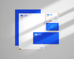

Kapital Zone logo is actually an anagram formed by its initials. The implicit symbology is that of the iceberg, only a part of the whole is seen. This reflects the amount of possibilities that this financial consulting offers.


For the brand image we selected the traditional blue, with a twist of hue towards a light blue, in contrast the terracotta orange complements the color palette to give an dynamic and vibrant mood. A whole tone is provided by the flat and intense colors that contains communication.


As a development-stage organization, achieving a space in the mind of your market is essential. For that we established the idea of a structured and affordable organization: financial knowledge within the reach of each person.


Although not yet reached this stage, we have advanced establishing the language in its digital space.